Why “making it pop” doesn’t work, 🚩 for UX bootcamps, wicked UI Inspo
Hey Designers,
Hope you’re surviving another week! I’m currently going through a massive house renovation so that’s why I’ve been a bit of a 👻 lately
But as the demo continues are going I’m getting back into it and I’ve got some cool stuff to share with you this week
But first…
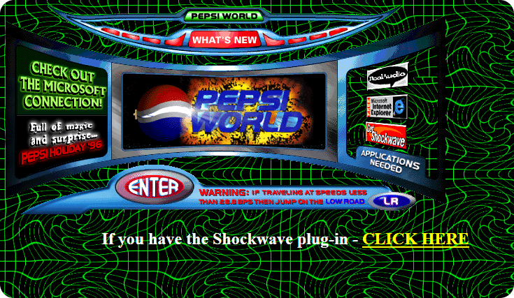
Can you guess the year of this webdesign?
Here is a hint: Nintendo 64 went on sale in Japan and the Hubble Space Telescope revealed images of Pluto’s surface for the first time.
“Make it pop” actually has the reverse affect
“Oh, sh&t, I think I needed that” ... me every time I close an informational or onboarding tooltip 🤦♀️. So instead of flooding your designs with popovers, think about how you can better integrate the info into your UI so the important things aren’t ignored by your users. Luke breaks this concept down with some great examples.
Live site > Figma
This design is jam packed with personality and flair but the interactions that came to life in the code are 🤌 P.S. it's made with webflow
5 red flags for any UX Bootcamp
🚩 They only focus on theory but never help you actually practice new skills
Fun fact, I quit my masters program because they were almost solely focused on theory 😞
🚩 No feedback or very little feedback on your work
🚩 No support, mentors, or coaches
🚩 No community or peer-to-peer collaboration
🚩 No real-world experience or even realistic projects
🚩 BONUS: No help prepping for the real world beyond just making a portfolio
😮💨 Luckily Springboard UX Bootcamp avoids all of these red flags and offers a killer curriculum, a variety of support, and community.
But wait, there’s more
Like visual content about UX & Product Design? Follow me on Tiktok or Insta
Looking to level up? Here’s some resources I’ve created specifically for designers
I go a bit more in-depth on specific topics over on Medium and LinkedIn but sub to this newsletter for regular goodies in your inbox 😎


